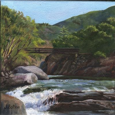
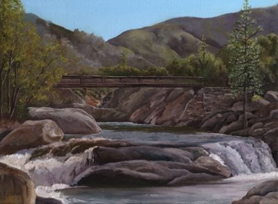
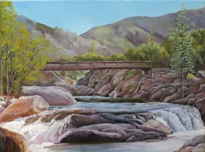
After finishing the 6×6″ painting of the Buckeye Bridge AKA the Paradise Bridge, I studied it along with the 12×16″ version. Why was the 6×6″ more appealing?
More contrast. Brighter colors. These are the usual reasons.
Now, the larger painting has brighter colors. When it is dry, I’ll rescan it and then we can compare apples to apples, or bigger paintings to bigger paintings, to be literal about it. (This is just photographed while wet on the wall rather than wreck my scanner by putting oil paint on the glass. I’m just cautious like that.) When it is dry, I’ll scan it so we can truly compare the before and after.
2 Comments
You’ve got me looking for bridges in Idaho.
Nice, Grey! Let me know if you find any that are particularly appealing. It is a little embarrassing to like something that is such a cliche, but that’s the way it is.
Have you started painting your hollyhocks yet?
Comments are closed for this article!