Loser to Best

This little painting was a loser because it wasn’t good enough for anyone to part with his hard-earned dollars, despite the fact that my works sells for prices that won’t scare anyone.

It is titled “Tulare County’s Best”, and although it shows what I believe to be the best that our rural Central California county offers, it wasn’t my best work.

It was my best plein air work at the time, because I was new to that style of painting.

But plein air painting isn’t my best work. 

Shut up about “best”!

I repainted it, and here it is, now deserving of its title.

Tulare County’s Best, 8×10″, oil on wrapped canvas, $125

OF COURSE IT LOOKS BETTER IN PERSON.

Better Painting

After I took a plein air (on location) painting workshop, I tried to incorporate some new techniques into my normal studio method of painting. I didn’t like the results, and apparently, no one else did either, because those paintings didn’t sell.

This one in particular was troubling, because I thought the subject matter would overcome any difficulties.

After goofing off for weeks, I decided to warm up to painting by improving this little loser.

Better sky

Better snow

Better distant mountains and hills

Better Painting


When it is dry, I will scan it so we can all scratch our heads in bewilderment about how I could have ever thought the painting might sell in its earlier state. 

Guess I was blinded by love for the subject matter of Tulare County’s best features.

P.S. I didn’t mess with the orchards or wind machines because they look fine.


Look What I Tried Next With Colored Pencils

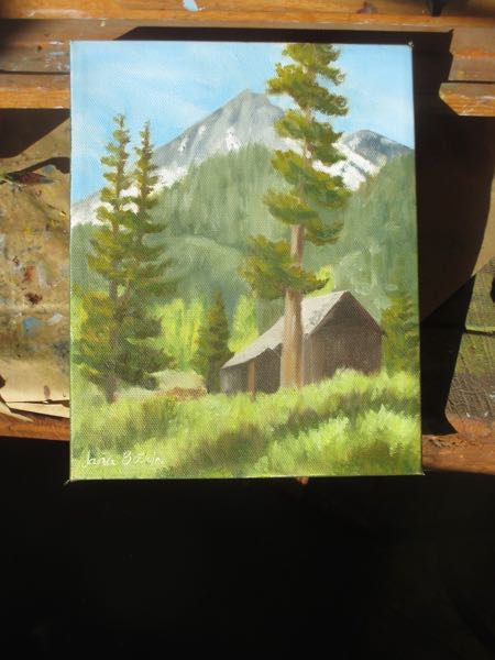
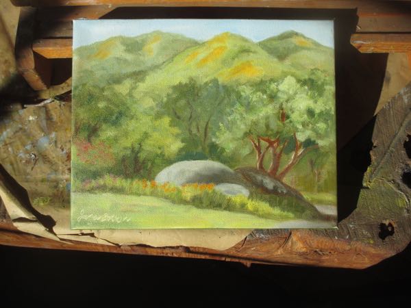
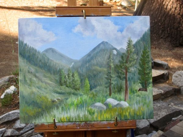
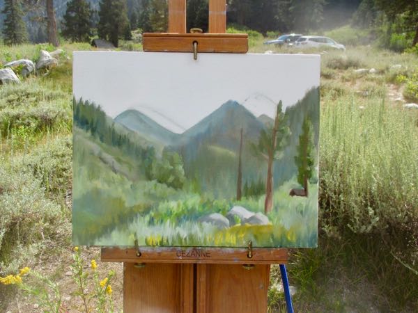
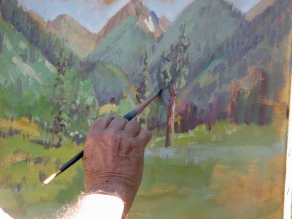
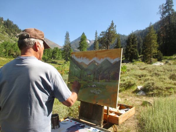
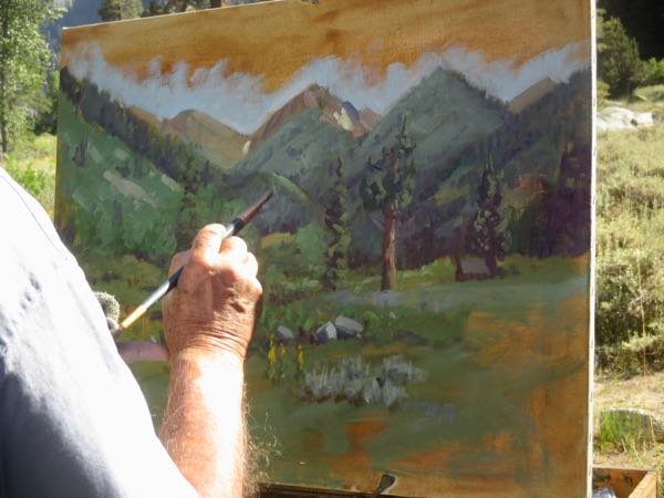
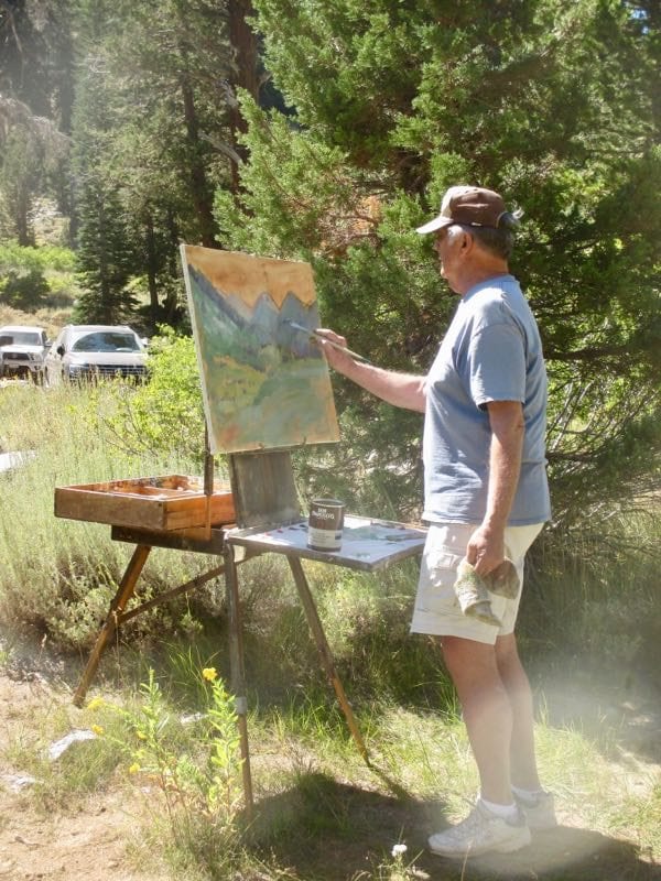
If you can’t see the photos, go here: cabinart.net/blogSometimes I just live on the edge. In 2019 I took a plein air oil painting workshop, wanting to learn the skills of slamming out a painting before the light changed too much. It wasn’t easy for this studio artist who is used to a fixed environment, working from my own zillion photos. It wasn’t easy for this near-sighted artist who has fought to see clearly her entire life to enjoy painting loosey-goosey. Blurry on purpose?? Why would anyone do that?

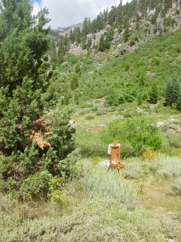
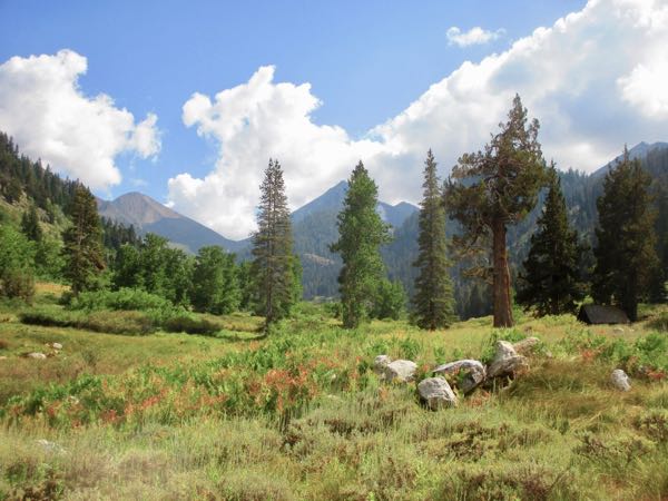
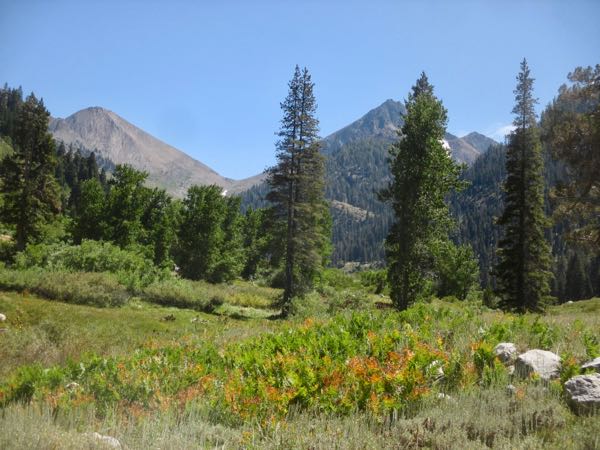
Being somewhat adventurous with my art doesn’t come easily to me. However, I took a clipboard with a piece of good paper and my box of twelve (times two) colored pencils down to a spot along the creek in Mineral King.

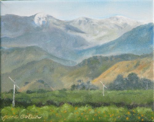
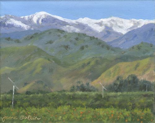
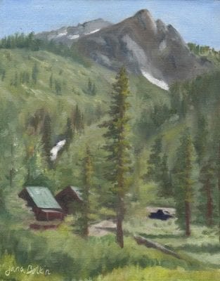
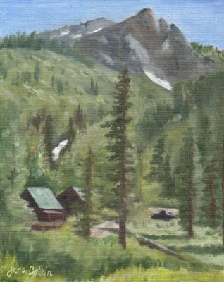
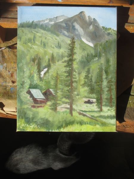
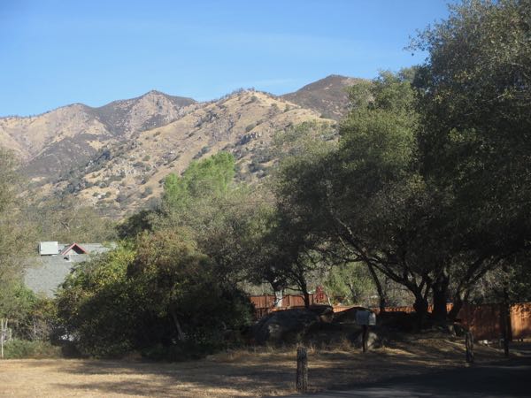
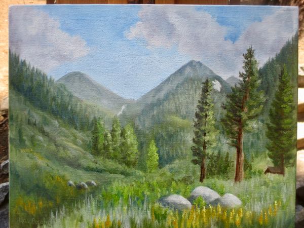
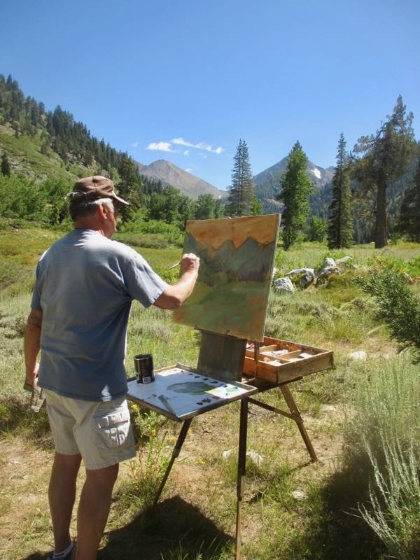
First I photographed the scene so I would know what to do if/when the light changed or if it took too long and I needed to finish it in the studio. (Please, please, let me work in my studio, you mean bossy fake plein air artist!)

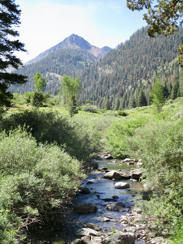
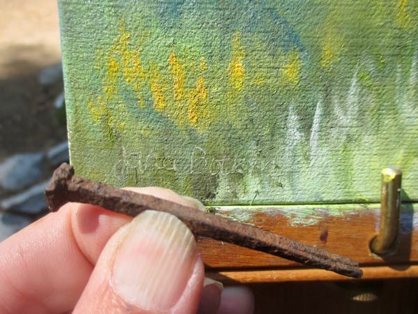
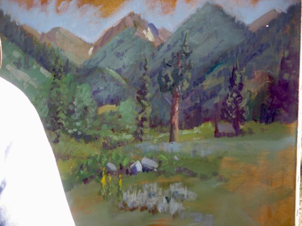
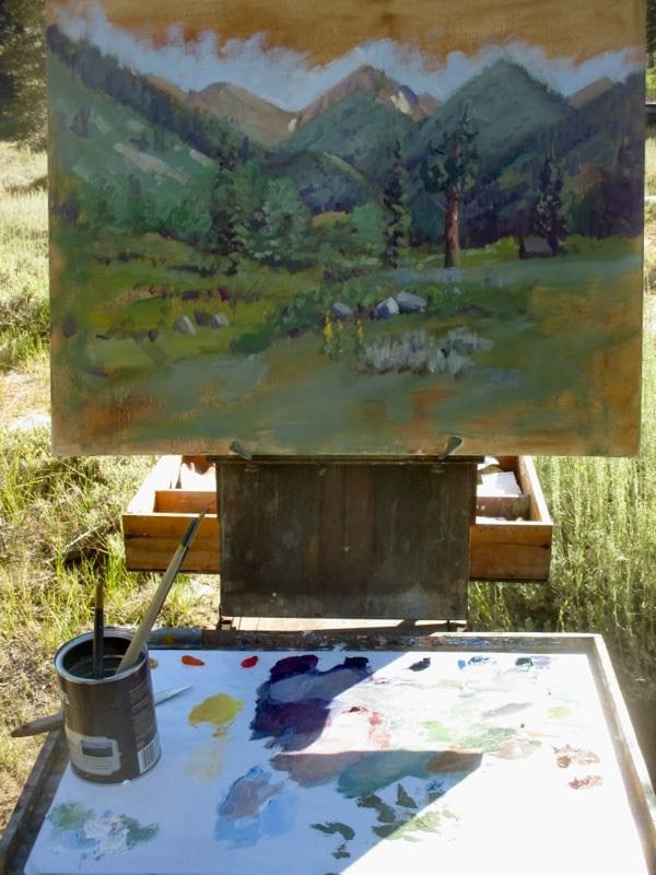
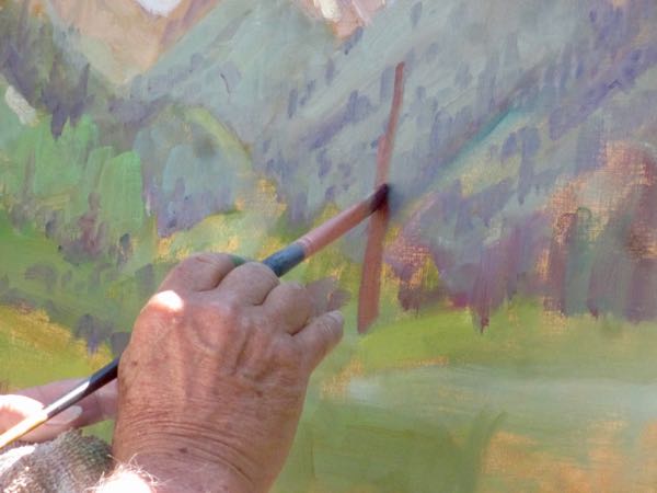
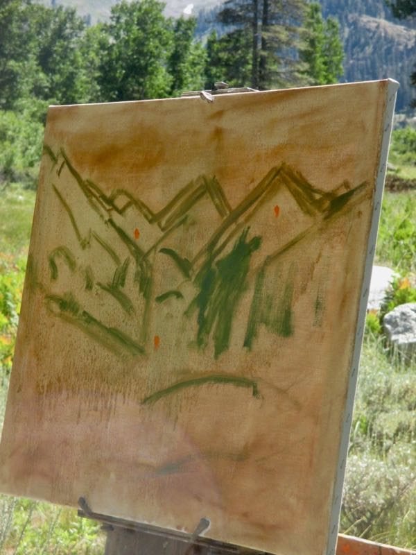
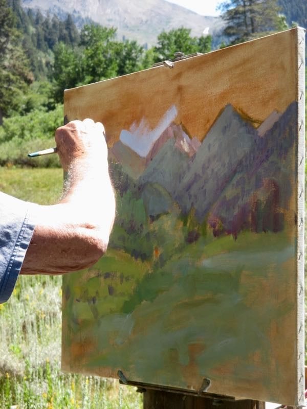
Then I began drawing, this time using Polychromos, because they don’t need sharpening as often as Prismacolor and they don’t break as easily. I chose brown for sketching, because the plein air oil painting teacher had us put our first layers down in a brown.

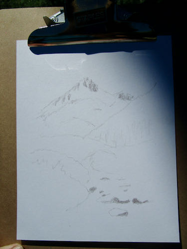
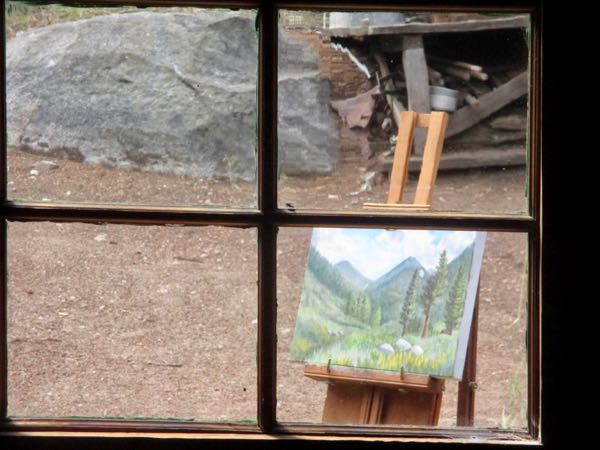
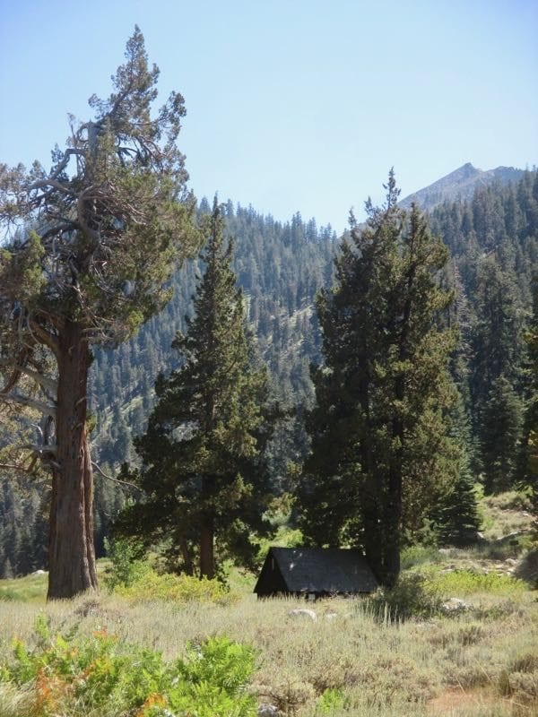
This is hard. Maybe I should just do the Honeymoon Cabin as it looks from this perch in the dirt.

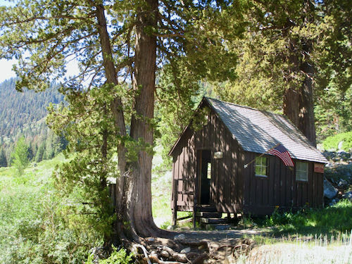
Never mind. Focus, Central California Artist!

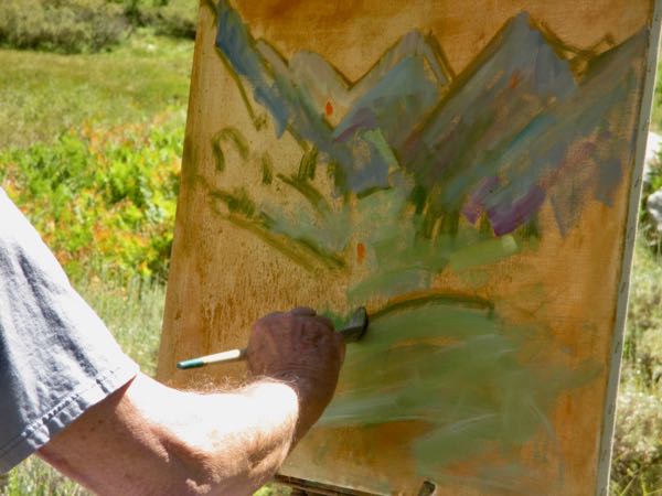
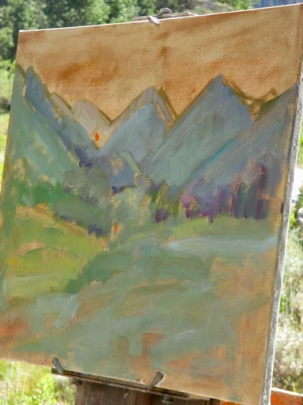
Forget all that brown. I want to start coloring, because I know it will take umpty-umpt layers to even vaguely approximate the colors I see.

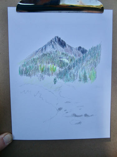
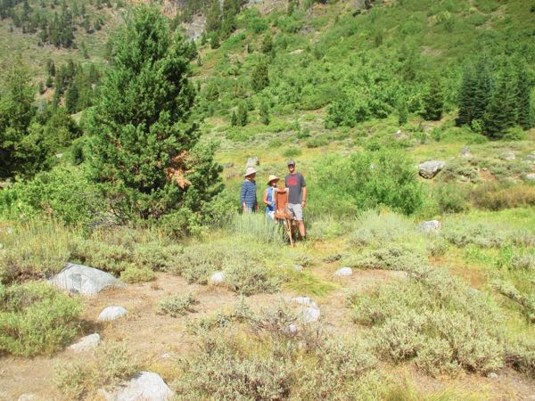
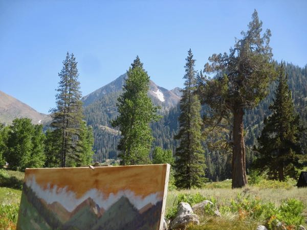
This is hard. These colors are inadequate. My hiney is sore from sitting on this dirt perch. Other people are hanging out together having fun.

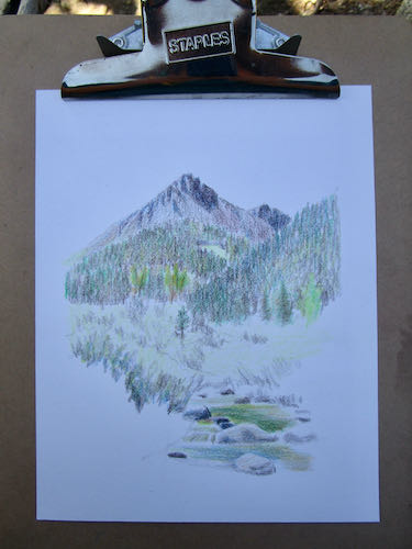
Why exactly am I doing this?

No good reason. Guess I’ll stop now and head back to the cabin. 

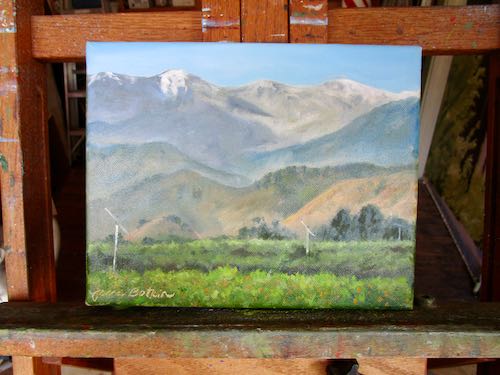
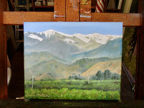
Maybe I will finish this, and maybe I won’t. I have several paintings waiting to be done, and there will be payments when I am finished. 

Sounds like an easy decision.

Tightening Up Plein Air Paintings

This past summer I painted plein air (on location) in Mineral King for the first time in about a dozen years. The results were mixed; I wasn’t fully satisfied with 2 of the paintings.

So, I put them back on the easels last month and tightened up the details. Can you see the difference?

Before
After – Crowley Cabin, 8×10″, oil on wrapped canvas, $125
Before
After – Empire and Cabins, 8×10″, oil on wrapped canvas, sold

There are always more things I could have done. (Time for me to stop looking at these.) And be assured, they always look better in person.

Indecision

“Indecision” sounds a lot like “indigestion” which sounds a bit like “indigent” which means “poor enough to need help from others”.

These paintings might be poor enough to need help from others. I can’t decide if they are finished, if there is a way to improve them, or if they just need to be painted over with something else.

I like it, then I doubt my own opinion, then I decide to just sign it and be finished, but I can’t because something unknwon is holding me back. I can’t decide.
This was my first plein air painting in Mineral King this summer. I hid in the trees so no one would watch me flail around. Does it need more light on the edge of the larger red fir? Maybe wildflowers in the foreground would solve whatever it is that makes me not love this painting. Maybe it needs to be detailed, the way I normally paint. I can’t decide.
There was no good place to stand on the bridge so I was off to the side, and had to be careful each time I stepped back to not trip or step into traffic. I’ve painted this cabin scene so many times before, but never from this angle, and never with this lack of detail. Does it need more detail? I can’t decide.
This was painted in my front yard shortly after I returned from the plein air painting workshop in Georgia. I think it is boring, in spite of being the best time of year. Is it boring or is it just that “familiarity breeds contempt”? I can’t decide.
This is how the same scene looks now. This photo is definitely boring, but Three Rivers is still the best place to live in Tulare County. No indecision in that department!

Finishing a Painting in Mineral King

I set up the easel in the backyard of the cabin and worked on the painting from memory and the “visual notes” I had made the day before. That’s what Marty Weekly did, so I figured it must be a good plan.

Wait! He didn’t set up in my backyard; he took it home to finish in his studio. His plan was 2 sessions, using little examples of colors and textures that he placed on the canvas during his plein air session.

Not done.
Done, but not signed. I forgot to bring my signing tool.
The obvious Mineral King solution was to use an old square nail.

It made me happy to look out the window and see a plein air painting that I liked. Being familiar with the scene, having seen Marty’s way of tackling it, and adding the details I love all made the difference in my confidence and ability.

Of course, if it doesn’t sell in about 15 minutes, I will be questioning my confidence and ability.

And there was a third session to paint the edges.

There will be a fourth session to write the title on the back and add a hanging wire.

A fifth session will be after it is dry: scanning the painting.

But wait! There’s more: it will need varnishing.

Mineral King Valley, 11×14″, $300 (+tax – welcome to California)

Painting in Mineral King

After watching Marty Weekly paint, I caught the plein air bug again. I wanted to set up in exactly the same place, same time of day, and attack the same scene, using the methods that Laurel Daniel taught back in April.

Following Marty’s example a little bit, I painted 11×14, which is HUGE for plein air after doing 6×8″ paintings with Laurel.

I forgot my camera, so after painting for about 1-1/2 hours, I went back to the cabin to get it. What a hoot to walk away from a wet painting on an easel with a full palette just sitting out there in the elements. No worries because it was an extraordinary day.

This is how far I got in that first 1-1/2 hour.
It seemed to me that the distant mountains weren’t as pale as one would expect, so I took a black and white photo to check the values. Sure enough, not very pale. But what would you expect when they are only 6.5 miles if you don’t cut any switchbacks? I bet they are really only about 3.5 miles away.
Here is how it looked in color.
Trail Guy showed up and took a few photos of some friends that stopped by to check on the progress. (Yes, they are very tall people.)
See? I was actually there painting in Mineral King.
So was Trail Guy. (That’s my photo face, and yes I do wear dresses in Mineral King and yes I do wear them with my trusty Crocs.)
I like photos like this, showing the painting in the setting. (The clouds will NOT hold still so I have to make them up.)
I quit after about 2-1/2 hours, but, taking another lesson from Marty, I knew I’d work on it the next day.

Enough. Come back tomorrow for finishing the painting.

Watching a Master Paint in Mineral King, Part 4

This is the scene we were viewing.
This is the painting at the end of the afternoon.

Watching Martin “Marty” Weekly paint plein air in Mineral King was a huge privilege and a great learning opportunity. It is one thing to take a workshop in Georgia, where everything is unfamiliar. It is another thing to watch someone paint a landscape that I know very well, so I can understand how decisions are made to include some items and simplify or ignore others.

Here are some of the many things that Marty taught me in the 3 hours we stood there together:

  1. If your brush feels comfortable, try the next size up. (Why? I try to do this so that I get the painting finished in a timely manner, but I think Marty does this so he doesn’t get overly detailed.)
  2. Cobalt blue with white mades a very accurate sky color.
  3. All paintings look terrible in the beginning, even if you are as terrific as Marty Weekly!
  4. Adjust the parts of your painting to suit you and make the best composition possible, while retaining the recognizable characteristics of the scene.
  5. No one finishes on location; almost every plein air painter knows there will be finishing required in the studio.
  6. Turpentine from the hardware store is good enough – no need to pay for overpriced art supply turpentine.
  7. There is a brush cleaner available from the hardware store that will salvage any dried-out brush (I can’t wait to try this!)
  8. Try Permanent Rose instead of Alizarin Crimson for one of the mixing reds. (Why? I have this color, so I will find out!)
The sky can be finished in the studio, along with the various vegetation in the foreground. We talked about Goldenrod, Sage, and Asters, which are all present in September; he made visual reminders. We also talked about the stream, getting at least the lay of the land so there is a sense of the stream.

I am looking forward to seeing the finished painting! Since the intended recipients are friends of mine, I will ask to see a photo, and hope I can show you.

Watching a Master Paint in Mineral King, Part 3

Marty and discussed the weirdly shaped juniper. The light on the edge of it was compelling, and he decided to put it in, but not the same size as it is in real life. The trouble with that scene in real life is that there are 4 trees, all in a line, all the same height and evenly spaced. If it were painted that way, it might look like a sad little orchard rather than a natural scene.

When he added the light on the edge, the tree came alive (not literally on the canvas but you know what I mean, yes?)

We discussed the Honeymoon Cabin. Marty didn’t know what it was, and his wife and I convinced him it was important to include, especially because the painting is to be a wedding gift for a couple who knows Mineral King.

He worked his way down into the lower reaches of the painting, which looked like a daunting amount of real estate to me.

We discussed the snow patch on the side of Vandever, which is important enough to have a name – Bearskin. It is often speculated about during the summers as we wonder how long the snow will last. The addition of Bearskin made it necessary to add the remaining snow right below Farewell Gap. He also added in Falcon Peak, which is really just the headwall of White Chief Canyon (to the right of Vandever).

Marty also did some reshaping and tightening up of the accuracy of some of the shapes. Because he paints in a loose and impressionist style, this surprised me. But, his scenes are always recognizable, so of course he wants the shapes to be correct. We talked about the top of Vandever, which wasn’t visible from where we stood, and I was able to tell him that the top is jagged and it is taller than West Florence on the left side of the gap.

We discussed the vegetation, and he made some visual notes so he would know how to finish things later in his studio.

On Monday, I’ll tell you some of the many things I learned from watching Martin Weekly, master plein air oil painter paint in Mineral King.

Watching a Master Paint in Mineral King, Part 2

As Martin Weekly set up his painting, I stood in the shade of the juniper, took photos, and just listened and watched. As a Questioner, I bit back many questions, and waited for him to either talk to himself or to address me directly. He shared a tremendous amount of experience and information, which I wrote down when he was finished for the afternoon.

The second roughed in sketch.
Blocking in begins.

There is great comfort in knowing that even the work of a master begins looking scribbly and worrisome.

See those bright orange dots? That is the way Marty checks his values (the darks and lights) because orange is a strong middle value. He can compare any color to see if it is darker or lighter, because a painting needs all the different darks and lights to be good.

This is the scene we were viewing, but of course our eyes take in so much more when standing on location than can be captured by a camera lens.
Marty sees colors differently than I do.
We joked about how paintings look so dreadful in the beginning stages. I always say, “Best viewed from the back of a fast horse”, and he said, “Might look good at midnight with the lights out while wearing sunglasses”.
To the right side of the scene is a weirdly shaped juniper tree and the Honeymoon Cabin. I wondered if he would include those 2 signature items that tell exactly where we are.
It was time for sky so the top of the peaks could be defined. Marty uses a different color of blue than I do for skies, and I thought it was perfect! Why haven’t all the various instructors I’ve had ever mentioned Cobalt blue for skies?? Everyone else swears by Phthalo or Cerulean blue!
We talked about the weird juniper, and Marty thought about it. He decided to not have any trees shooting up above the line of the peaks. This was a concept I never considered; I thought if you made the trees too short, the perspective would look wrong. Not so when Marty does it!

To be continued tomorrow. . .