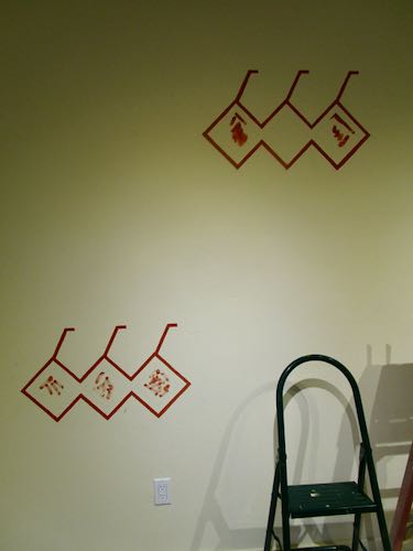
Today I will show you what I submitted for the 2nd mural on the Ivanhoe Library.
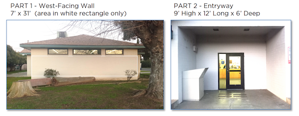
For review, here is what the selection committee provided.
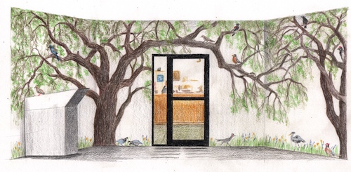
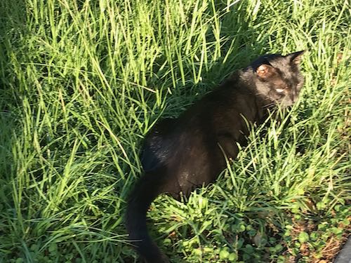
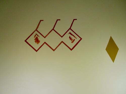
Here is what I submitted for this entry way.
Here is my explanation.
“Mural B shows 2 Valley Oaks, quercus lobata, which is the largest American oak, native to Tulare County. In and beneath the trees are local birds, all seen in and around Ivanhoe, along with a few wildflowers at the base. This could be used as a fun method for children to learn their local birds.
Now, we shall see if I actually get to paint these two murals.
P.S. The commenting part of the blog has been misbehaving but comments are coming through anyway. So to those of you who soldiered through, thank you!
Okay, I’ll quit stalling now. This is what the Ivanhoe Library mural project gave to the potential artists.
First, I introduced myself with this.
“I am very pleased to be able to submit two designs for the library of my youth. I grew up outside of Ivanhoe, attending Ivanhoe Elementary School K-8. I credit my 6th grade teacher, Tom Stroben, with teaching me to draw, and much of my childhood was spent reading books from this library. It would be a huge honor to be selected as the muralist for this Tulare County treasure.”
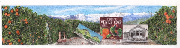
And this is what I submitted for the long wall.
This is the explanation that accompanied the sample. The selection committee didn’t ask for this, but they got it anyway.
West Wall is an orange grove with the mountains in the distance and three insets. The mural shows a picker on a ladder (partially hidden), smudge pots, and a wind machine. In the distance are the Sierra Nevada as the peaks show on a clear day from Ivanhoe. The insets are (L to R) Twin Buttes (a geographical landmark north of Ivanhoe), an old citrus label from Klink Citrus (chosen because of the colorful rooster and the name “Venice Cove”, a nod to another geographical landmark, Venice Hills, east of Ivanhoe), and the old Ivanhoe School Auditorium, which housed the school library in the years I attended school there. (1964-1973).
Okay, I’m going to drag this out for another day. Next post about this project will appear on Monday, November 27.
I am stalling in showing you the actual designs because I feel gun-shy. After 14 months of working with a large organization and then never getting the job, I am cautiously optimistic that this mural job will come to fruition.
So, today I will simply show you the pictures I presented to the mural selection committee of previously completed murals. Had to prove that I knew what I was talking about.
Top to bottom:
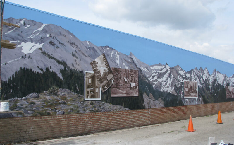
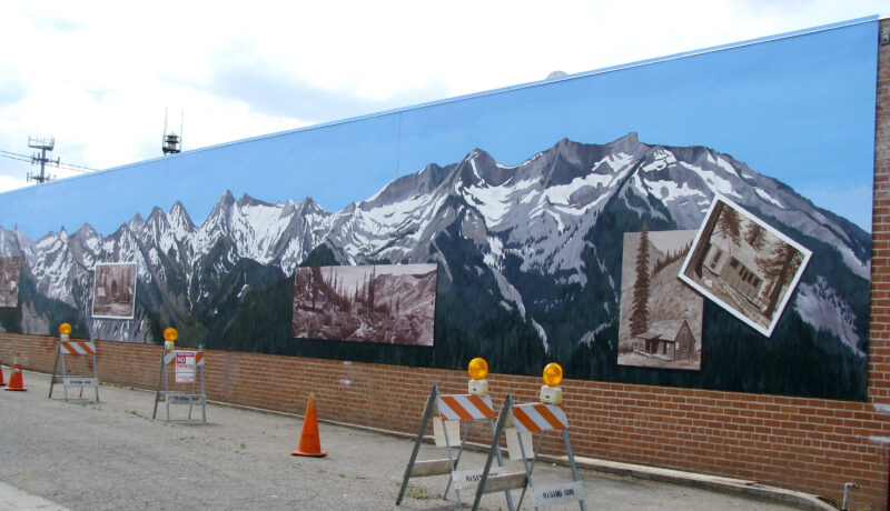
1. Mineral King in Our Backyard, E Street, Exeter, 13×110’, completed in 2009 and refreshed in 2017, as seen looking east
2. Same mural, looking west
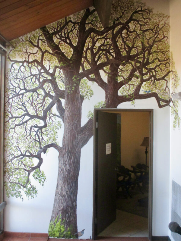
3. Oak tree, St. Anthony’s Retreat, Three Rivers, interior mural completed 2020
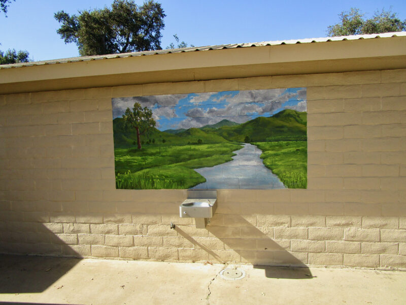
4. Yokohl Creek, Mooney Grove, 4×8’, completed 2022
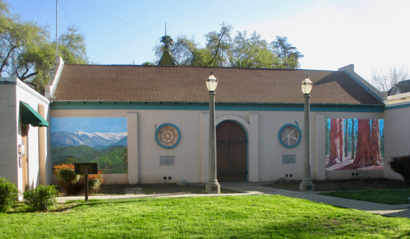
5. Tulare County History Museum, 4 exterior murals, completed 2020
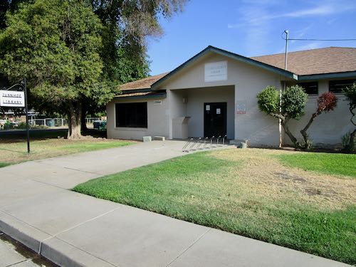
I grew up in the country, with the choice of asking Mom to drive me or riding my bike if I wanted to go somewhere. (One did not bother Dad, because he was working; we were Mom’s work.) She rarely denied me when I asked her to take me to the library 2-4 miles away (we moved closer when I was in 6th grade), which was (and is) very small.
It was a challenge to find new books to read in that tiny building, but I never gave up trying. We either didn’t know about or didn’t have the option of ordering books from other county libraries as we do now. And I remember the first time I went to the library in the big town instead of the little burg—it was mind-boggling in its enormity. So many books, so little time!
Over a year ago, I was asked to paint an outdoor mural on the library of my youth. Within a week, I drove there with sketch paper and a tape measure. I met the librarian, who turns out to be a close friend of my sister-in-law. (Welcome to Tulare County, and never talk bad about anyone!)
Immediately, I began scouring my memory for ideas, and without knowing the budget, I came up with 3 versions—each one emphasizing different aspects of that nondescript rural unincorporated town, and different sizes for pricing options.
Alas, the Asker didn’t return my phone calls. I saw him in person, he apologized, and then still didn’t follow up. So, I let go of that dream.
Several months later, the Arts Consortium put out a Call-To-Artists, for not one, but TWO murals on the library of my youth. WHAT?? That was supposed to be MY mural.
Allll-righty-then, at least I had a headstart. I designed a second one, did the best presentation sketch possible, and even wrote an (unasked for) explanation and a (also unasked for) heartfelt statement about why I am the most qualified for this particular project. I met the deadline, and then waited to hear when I could begin. (Can you say “overconfident”?)
The deadline to notify the winner came and went. Silence. I asked the Arts Consortium who got the job, and the reply was that the selection committee was unable to meet. More months passed, and I asked again. This time the answer was that the selection committee was unable to decide.
I gave up, let go, moved on, while wondering what in the world is wrong with organizations and why I allow them to waste my time. I lost the big Catholic church murals—might as well add this to the pile of missed opportunities, and make a note to just deal with individuals in the future, rather than large outfits.
Then, 14 months after I was asked to paint a mural on the library of my youth, the Arts Consortium emailed that I HAVE BEEN CHOSEN FOR THE JOB!!
Stay tuned to see the sketches, hear the explanations, and learn when it will begin.
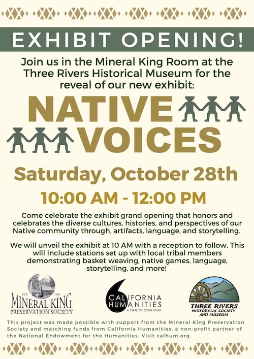
. . . the mural/graphics at the Three Rivers Historical Museum? You’ll have to attend the exhibit opening of Native Voices to see!
2. . . . the murals at the giant Catholic church in Visalia? After 13 months of much wrangling, negotiating, emails, phone calls, designs, rewriting of proposals, and rebidding, I withdrew my proposals. They’ll have to find someone else for this. (I’d show you my designs, but I don’t want anyone to kipe them.)
3. . . . the mural for a county library, mentioned back in August of 2022? Nothing. It was promised to me, then silence. A call to artists went out, I submitted my designs (because it expanded from one wall to two walls), then silence. The deadline for a decision passed (May 31), and the silence continues.
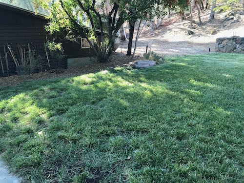
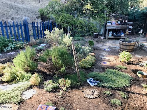
4. . . .my overgrown unmowed lawn? After the 5th summer of not mowing, hand trimming, transplanting, and fertilizing, it is looking quite nice. Now that it is mowed, I can see the gaps, and next year I will continue to transplant clumps as I find them at the back of the house where there used to be lawn.
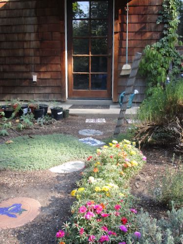
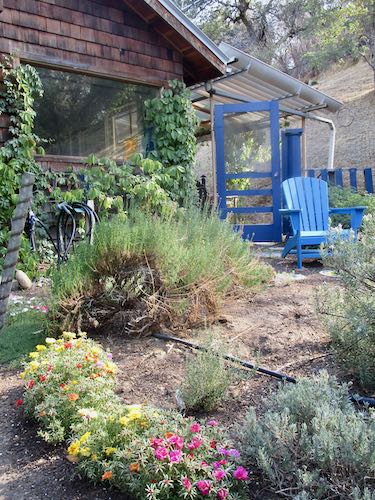
5. . . . my gardening efforts once I started using an expensive humus, Deer Out, and milorganite fertilizer? Things look moderately better, although not magnificent. (Let’s remain in Realville, people!) This is the herb garden, fenced against deer, many plants with underground baskets against gophers, very poor soil, direct hot sun in summer, and zero sun in winter.
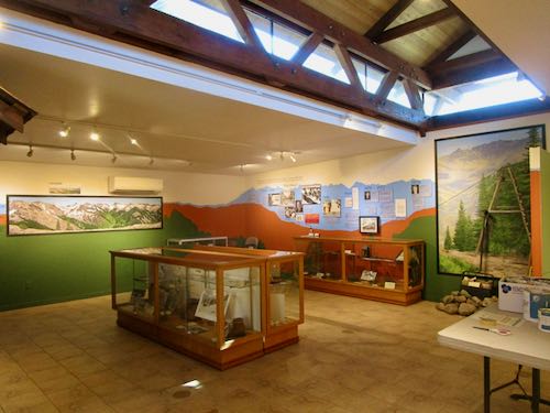
So far I have only told you about the steps toward painting the display on a wall in the Three Rivers Historical Museum. I finally began applying color to the wall.
It took two coats for the colors to be strong enough to cover. My plan was to freehand the “shadows”, and afterward, use the soft white base coat paint to cover the wobbles, hairs, drips, and smudges.
The bottom center photo shows what was behind me in the Mineral King room. Those are my murals on the walls. It was a real privilege to get to paint in this peaceful place, working for accommodating people, just 1-1/2 mile from home.
The exhibit is on the north interior wall of the Mineral King Room in the Three Rivers Historical Museum. (Really, shouldn’t this be called a “history” museum rather than a “historical” museum? This bothers me. The museum isn’t historical; however, I didn’t name it and can read their sign and website and then call them what they call themselves.)
The exhibit is called Native Voices.
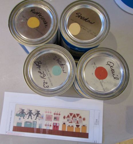
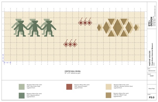
The designer chose the colors.
The designs are from Yokuts baskets.
I will freehand the design rather than tape.
It will take a lot of time to paint out the drips, wobbles, and graphite smudges, but less time than taping and then hoping everything stays in place when it dries and the tape is removed.
I only traced the main designs and will have to figure out how to do the “shadows”.
I would dearly love to know how the designer thought I’d get the designs onto the wall.
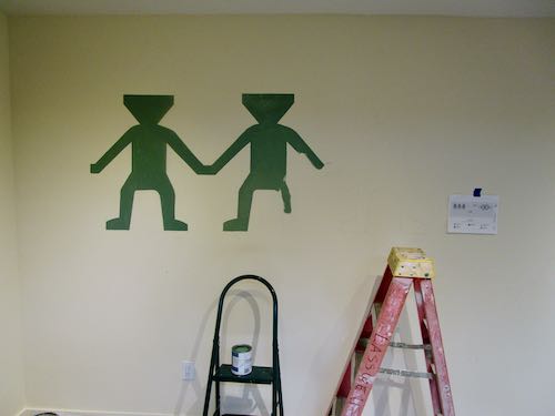
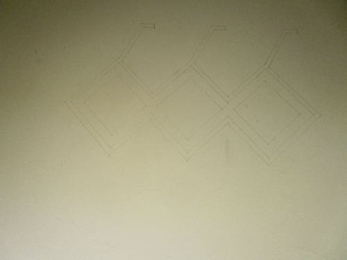
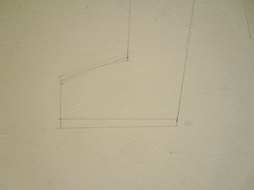
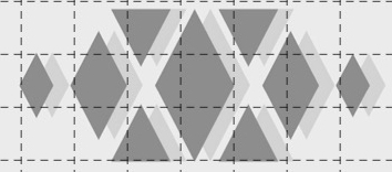
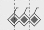
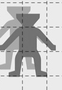
This last picture shows the design with its “shadows”, along with three of gray people-ish shapes to give an idea of how the finished wall will look. On the left is The Gathering, in the middle is Quail (but the lighter versions won’t be included), and on the right is Rattlesnake.
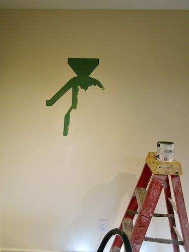
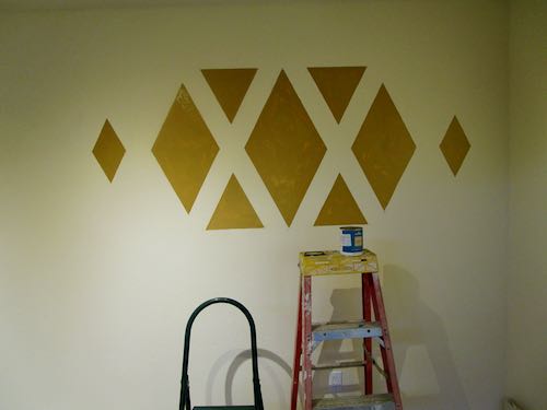
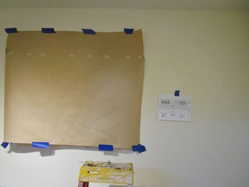
The quail design had to be repeated, this time higher and to the right. I was on a roll, had this thing figured out!
Trail Guy stopped by to see how things were going. His timing was excellent, and he helped me place this design higher on the wall, measuring and leveling.
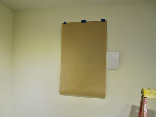
It was too big for the kraft paper, so I only drew half of the design, thinking I’d just flip it over and finish it. However, I had to “scab” another piece of paper and finish the drawing, then trim it when we flipped it over. I was thankful that he was still outside, reading through the exhibit on the New England Tunnel and Smelter Company (a Mineral King exhibit).
After tracing that pattern, called “rattlesnake”, I went home for lunch. Tony’s Taverna has a food truck outside the museum, and I know the food is terrific, but I am too frugal to spend $20 for lunch when my kitchen is less than 2 miles away.
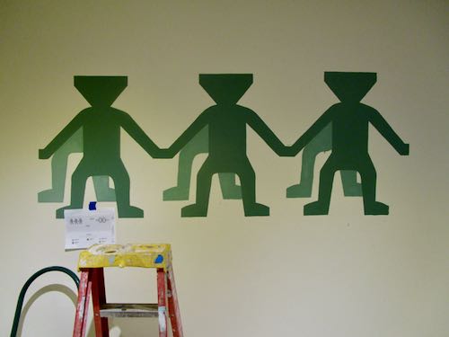
After lunch, I returned to finish the final design, which I called “little men” but learned is called “The Gathering”. This one had only one little man traced, and the plan was to keep moving the pattern over until all three were in place.
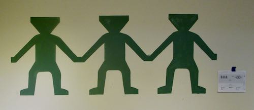
Oops. There was a mistake. I fixed it, repaired it on the wall and on the pattern, and then worked the little man across the wall. I didn’t tape the bottom of the pattern, because I had to keep lifting it up and crawling beneath it to place the graphite paper, three positions for each little man.
When I thought I was finished, I could see some problems with the little men’s feet not lining up. This is something I could fudge into place (what a weird use of the word “fudge”, but I bet you know what I mean).
Finally, here is a weird thought. As I was figuring out how to do this, I realized that I learned these skills from my mom. When?? Where?? When?? I don’t know, but I feel certain that I must have watched her create a pattern and transfer it somewhere, sometime.
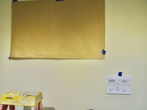
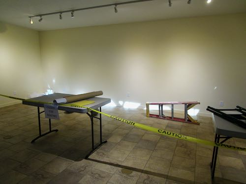
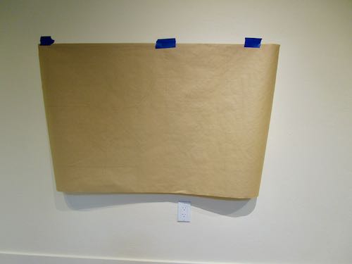
I enlarged these designs onto kraft paper, ordered some very large sheets of graphite transfer paper, gathered a few tools, and drove to the Three Rivers Historical Museum. My job bosses had prepped the wall for me, and they also blocked it off in a very serious manner, along with providing a ladder and a couple of tables. (They are TERRIFIC to work for!)
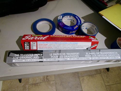
I had previously tested some carbon paper to see if I could transfer through the kraft paper, but had to go searching at Blick Art Materials for some large graphite sheets. There were two to choose from, and instead of accidentally ordering the wrong one, I bought both.
We measured the wall very carefully to mark the center and then figure out where the first design was to go. Then I taped the smallest design up, trying to see through the kraft paper to place it exactly on the mark I made, adjusting it until it was level.
The design was drawn in pencil, so you can’t see it on this photo. I kept the bottom untaped so I could lift it up to place the graphite paper.
MASKING TAPE WOULDN’T STICK TO THE GRAPHITE PAPER!!
The museum came to the rescue with old-fashioned brown masking tape instead of the easy-removing blue type.
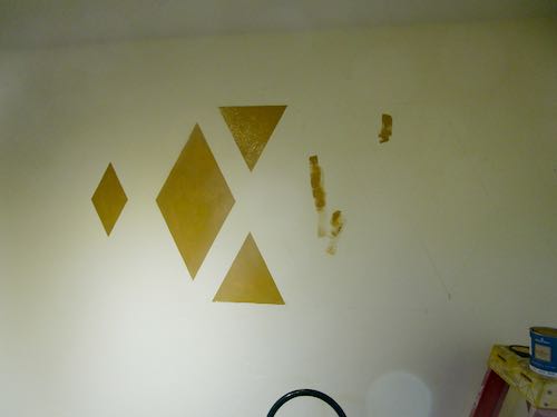
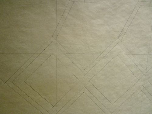
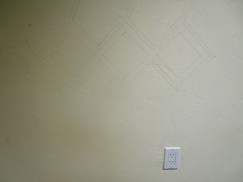
This design is called Quail, taken directly from a Yokuts basket design. I used a straight edge and traced over the pencil lines with an obsolete tool from the olden days of phototypesetting that my students and I refer to as a “spatula”. (Too hard to explain.)
Squint hard, and you can see how it landed on the wall.
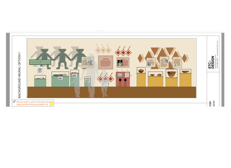
Nope. Some are designs, created for museum displays, by exhibit designers. The Three Rivers History Museum hired a museum designer, an exhibit designer, whatever the title is, to create a Native American exhibit, and they (or is it the Tulare County Historical Society? Or the Mineral King Preservation Society? I should pay more attention!) to execute these designs.
Every new job I take on has an entirely new set of challenges. How does one take this little PDF and turn it into a wall design? These exhibit designers may not have completely thought through the execution phase of the display. However, maybe they do know how to do such a job and just didn’t tell the museum. Maybe it involves equipment and technology that I don’t own.
No problem. I figured it out.
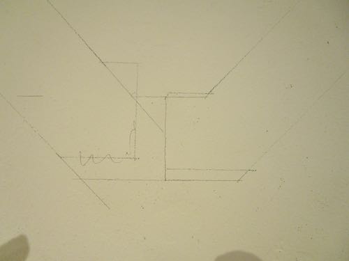
The designer sent it with a ?”=1′-0″ grid over the top.
I turned it to black and white, isolated each group, and printed it. (These samples don’t show the whole designs—just wanted to give you an idea.)
Next, I got some giant kraft paper (looks like brown butcher paper on a great big roll, and if you have ever received a wrapped gift from me, you know what I’m talking about) and laid it out on my drafting table. This was quite a big jump from my normal 11×14″ pencil drawings.
And then, I started measuring and drawing.
It took an entire day.
What next? I had to figure out how to get the patterns on the wall. I’ll show you next week, after our monthly Learned List.