A friend is learning about art, practicing diligently at watercolor, taking workshops and painting with a group in her town. She also reads about art, and has been kind enough to spend time with me, discussing various art related topics.
She told me about a book called “Breakfast at Sotheby’s: An A-Z of the Art World” by Philip Hook. Not only did she read it, she took notes. AND, she shared them with me!
Two main points interested me in our conversation about color.
1. In Breakfast at Sotheby’s, her notes say this: “Red and blue are the most important colors in modernist art.” (I’ll have to look up the definition of “modernist”. . . always something to be learned around here. . .)
2. One of her instructors believes that all paintings should have some cerulean blue. This is a lighter blue, leaning toward turquoise that I use when I mix colors. (I only use the primaries plus white to make all my colors with a few exceptions.)
While my friend and I sat together in my studio discussing color, we looked around together at the paintings hanging on my walls. We discovered 2 that had neither blue nor red. So, in a spirit of experimentation and adventure, I added some.
Artichoke before: 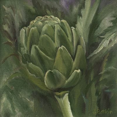
Artichoke after: 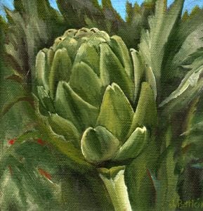
Now that is an unfair comparison. The scans turned out differently, although the size is supposed to be the same it is not, and I guess you’ll just have to see the painting in person. I promise that I didn’t mess with the greens. I did mess with the color and exposure on the computer, trying to get the 2 to match, but something just isn’t working.
Never mind. Have a nice day. Thanks for stopping by and making it to the end of this post. Perhaps I should just get to the easels and finish the Kaweah Post Office.
2 Comments
Very interesting. Maybe it’s the issue with the scanning, but the after does seem to “pop” more. Is it psychology (I mean, you did suggest to us that there would be a difference), or is it real perception? Perhaps it’s the framing of the “after” image that includes the blue that is influencing the perception. Beautiful, nonetheless.
Jon, thank you for checking in! The improved scan certainly skews the question. . . but, it does look better with the blue. Could be just the power of suggestion from someone I perceive as more knowledgeable. Art is SO SUBJECTIVE.
Comments are closed for this article!