New and Improved Farewell Gap

Last year I did an oil painting of a standard Mineral King scene, Farewell Gap. It didn’t sell.

No big deal. I took it to shows and put it on my website. It didn’t sell.

What gives? I took it back to the Silver City Store this year and everything has sold so far except that painting.

Finally, I showed it to my friend Tall Cathy, who has been going to Mineral King her entire life, which is about 10 years longer than my life, plus she started at an earlier age. (i.e. Tall Cathy is a bona fide Mineral King Expert.) I asked her, “What’s wrong with this painting?”

She said, “Little Florence is too low”.

I said, “Shoot. I was afraid of that. Guess I’ll take it back to the studio and redo it.”

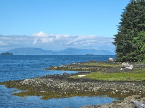
Little Florence is the peak on the left side of Farewell Gap, and it is lower than Vandever, which is the peak on the right side. Sometimes when you see it from a place other than the bridge, it looks very much lower. With 20,713 photos on my computer, I’m not going to look for the exact one I used for the painting. You can see the concept here:


Aside from the fact that normal people don’t lie in the grass to take photos, this is not the normal way that normal people view when they normally view Farewell Gap from the bridge. (There – have I successfully destroyed the word “normal” for you?)

Here it is in its new and improved version. Last year I photographed my paintings. This year I scan them. The color isn’t true either way. Look at the heights of the peaks – this is more of what people expect when they think of Farewell Gap.

Do you agree with this?

Another Tuesday Cruiseday

Cruising isn’t a very efficient way to see a place. Within the 10 days of the cruise, we had 4 days with our feet on land, and 3 of the 4 were in Alaska.

I loved Alaska when I spent 3 weeks there in 1977. I thought it was so fantastic that if I ever returned, I would never leave.

Seventeen-year-olds know precious little, but I digress.

Our first port was Ketchikan, Alaska.

ketchikan

ships-in-port


img_2681


We rode the city bus 12 miles north of town to Totem Bight State Park. This is where the cruise lines want you to go, but they prefer if you hire a van or one of their buses. Haha, we spent $1 each on the city bus. (The blue line, if you are planning a visit).

img_2685


“Bight” is pronounced “bite” and it is a bite out of the shoreline. (So why is it spelled funny?) I think the poles look so interesting and would sort of like to have one in my yard.


totem-pole-section

Tide pools were the added benefit of the park. Didn’t see much in them, but it was fun to be along the water.

totem-pole-top

Totem poles tell stories. They are not idols, but are diaries or journals. If I had one in my yard, it would contain pencils, a cabin, and a zillion cats. Oh, and yarn!!

img_2696

Next to Totem Bight is another totem park called “Potlatch”. It is more extensive, has a store, a carving room, a workshop room where children visit and work on a group totem pole, little cabins, a canoe, benches, totem poles (of course!), no entry fee, flush toilets, and fewer visitors because they don’t seem to be part of the cruise line network. It was better than the state park in terms of more to see, and it felt more authentic.

img_2697

After we got home, I learned this is a salmon berry. It might be because the seeds look like salmon eggs.

img_2702

We should have come to this park first. It was so very interesting!

img_2704


We were blessed with a brilliant and sunny day in Ketchikan. Rain is their normal weather.

img_2709


Isn’t this the coolest canoe ever? Can you imagine carving this with primitive tools? They must have had carpal tunnel syndrome.


Poppies For You!

Poppy I, oil on wrapped canvas, 4×4″, $35

Poppy II, oil on wrapped canvas, 4×4″, $35

Poppy III, oil on wrapped canvas, 4×4″, $35

Poppy IV, oil on wrapped canvas, 4×4″, $35

Or, special deal – buy all four together for $125!

Rainy Morning Fun in Mineral King

How many people does it take to build a futon bunk bed?

FIVE! (The white in the foreground is the so-called “instruction” sheet and reader’s hands, and #5 is taking the photo.)

No, SIX!! (The cowboy hat is on the head of an engineer, who was just as baffled as we were by the so-called “instructions”.)

What are all these people needed for?

One to read the directions, another to interpret, someone to find the pieces that the illustrations don’t accurately illustrate, someone else to decide which way the piece should go (which the instructions don’t instruct), two people to hold the pieces in place, two others to put the bolts in, someone to photo-document the process, and someone else to learn how to use the self-timer on a camera.

That is more than six, but some of us jump from task to task as needed.

This man is laughing as he undoes the top platform for the third time. Does that little bar go on top or on the bottom? Where are the holes to attach the ladder? Why is neither thing mentioned or shown on the so-called “instruction” sheet?

It takes a village to build a futon bunk bed.

After we placed it, we realized that climbing on the ladder meant bashing one’s head AND that the side windows in the little cabin will not open with this Thing in this place.

But, a good time was had by all, and the futon bunk bed is now assembled.

Isn’t it amazing what passes for entertainment in The Land of No Electricity?


How to Decide if There is Enough Contrast

When I worked exclusively in pencil, a drawing had to have contrast. My friend Debbie used to say, “Remember, black is your friend.” She was right.

Without contrast, a drawing is flat, plain gray and boring.

Paintings can sometimes get away with not very much contrast. They don’t look great, but the color distracts from the lack of value range. (Values are the darks and lights – “value” is a good Artspeak word to know.)

But, I am very aware of contrast and value because of my pencil days.

I painted this little canvas of Timber Gap in Mineral King. It didn’t look very good to me.


I converted the photo to black and white which confirmed my suspicions of not enough contrast.

There really weren’t enough lupine either, but that’s not the main problem.

Have a look at the redone painting in black and white.

Neat trick, eh?

Here is the finished piece in color.

Timber Gap, oil on wrapped canvas, 6×6″, $50