I’m No Abbey Ryan.

Recently my friend MA sent me some info about painter Abbey Ryan, and I watched a video of her painting. She finishes one painting every day and then sells it for big $ on eBay. It looks so easy.

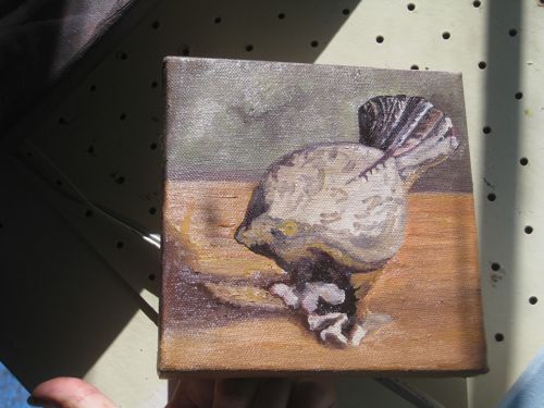
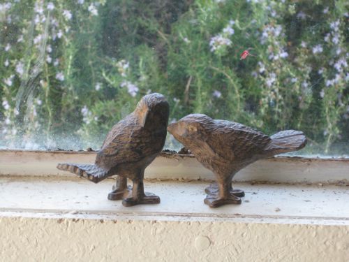
MA owns these cute little metal birds. She loves these guys, and I understand why!

She asked me to paint one for her on a 6×6″ canvas. I photographed them a bunch of different ways, this angle, that angle, 2 together in different poses, light on this side, light on that side, this one alone, that one alone. Then I deleted the ones that weren’t as appealing, cropped the 4 best ones to a square format, emailed her, and let her choose. She asked for one more angle, so I photographed it that way and sent her favorite along with the new one. She chose the first favorite.

I began mixing the colors while looking at the actual birds. The sun was so bright that I was sure I was getting the colors perfect! Mixing colors is so much fun, and it is sort of magical because of starting out with only 2 blues, 2 reds, a yellow and white.

Finally, it was time to paint. I couldn’t get the angle of light on the bird the way it was in the photo, and the light was too bright to see my computer screen photo well. I moved things all over my work area, and finally decided to just begin. I figured I could try getting MA’s bird finished in one sitting a la Abbey Ryan. I figured wrong. The brush is still not a pencil, no matter how much I practice. Finally I realized that the paint was just smearing around, messing up the colors, and no more progress would be made until it dried. Here is how the little bird looks after one painting session:

Good start, messed up feet, paint all over my hands from holding the canvas!
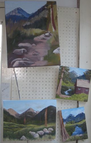
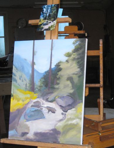
Layer by layer, canvas after canvas

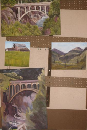
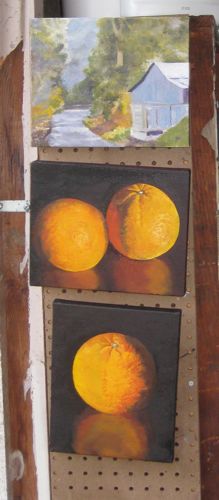
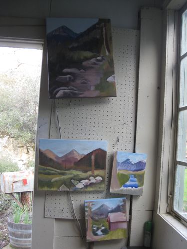
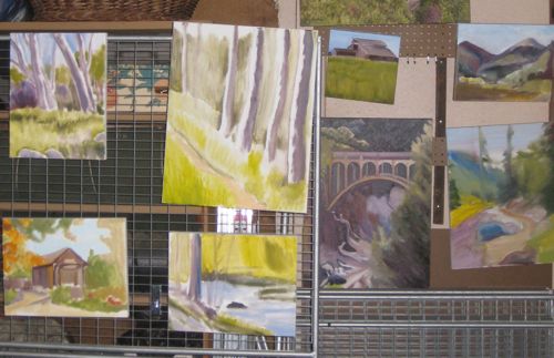
Still rotating around the workshop among the many paintings in progress. At some point I may stop showing you these, because I want you to attend the show at the Tulare Historical Museum. And, when you attend, I want you to say “WOW!” rather than “Oh yeah, I saw that one while it was being painted”. Not sure when that point will be reached. More will be revealed. . . or hidden, in this case.

Odd Jobs

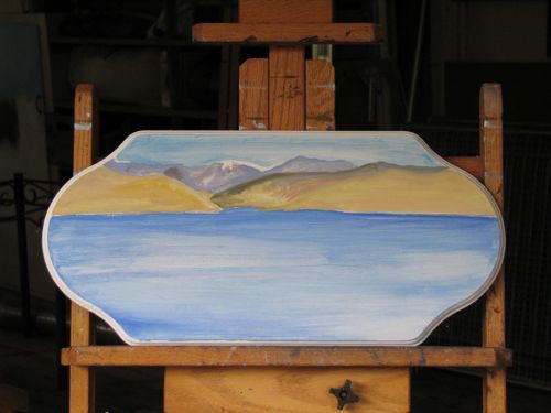
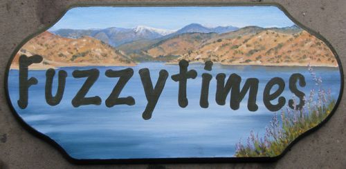
This is a sign for a houseboat. The customer brought me the sign form and I had to design a few choices for her, including a typestyle that she liked. (I didn’t name the boat!) She chose a design that looks as if it is a scene rather than just a strict lettering project. This was a challenge on several fronts – painting on wood, painting on an unusual shape, figuring out how to do lettering without it looking like my own handwriting or looking machine-like. Here is the beginnings of the project:

Here is the finished project:

In case you were wondering, I sort of “bounced” the letters a little for a playful look – with a name like “Fuzzytimes”, it seemed to require a bit of extra playfulness!

The Rules

This is the 4th in the series entitled “Thoughtful Thursdays”.  These are reprints of articles written by me for the local newspaper called The Kaweah Commonwealth with a few modifications for a wider audience.

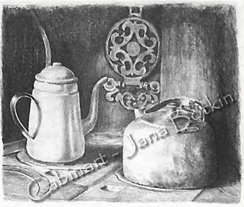
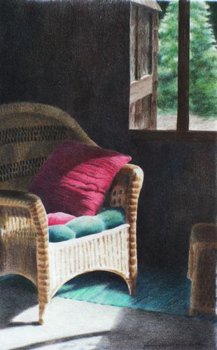
This was drawn using the entire range of pencils available.

There have been many art teachers in my life. Each one seems to have hard and fast rules that they insist apply to and be followed by everyone, or at least by all their students. Since I teach drawing, I understand this, but I try to clarify the reasons for my rules so that the students can decide for themselves.

One colored pencil teacher said to ALWAYS put the darkest color as the bottom layer and work up to the lightest color. (Gary Greene) Another said ALWAYS start with the lightest color as the base and then add layers in order of increasing darkness.(Ann Kullberg)  I have done both on the same drawing and gotten the same result! Other times, there is a difference, and I don’t know why.

Several colored pencil teachers have said NEVER USE BLACK. If you want darkness, build it up by layering the darkest colors. When I do that, it rarely looks dark enough but instead, looks as if I layered the darkest colors because I couldn’t find my black pencil. When asked about this bad black pencil theory, a different teacher of colored pencil simply said, “If you aren’t supposed to use black, why do they manufacture it?”

Some of the painting teachers I have listened to say “NEVER use white alone”. (What color is one supposed to use if white is the needed color??)  Most say, “NEVER use black”. I spoke to a professional painter whose paintings sell for more than my car is worth. He told me of his layering process and it included black paint!!

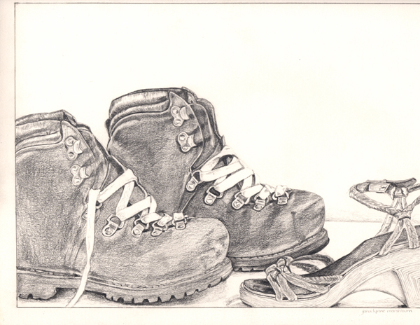
The best drawing teacher I ever had only let us use a 6B pencil, which is very soft and dark. We could not smear or blend with any tool, including our fingers. His premise was that if you could learn to control that one pencil, you could make any pencil do anything you wished it to do. He was right, but then it took me years to be able to use the entire range of pencils available because his idea was so deeply etched into my head.

This is a piece done under the guidance of Professor 6B.

Many of my students ask how to hold their pencils. I show them how I hold mine, and tell them to try it, and also to try anything that feels comfortable to them. As in handwriting, everyone has a different look to his drawings. The point is that there are many places in life where there are rules, but in art the only absolutes are determined by the results you desire.

Thinking About Facebook

A Thinking Place, 11×14″, colored pencil

In the fast-paced, always-changing high-tech world we occupy,  there are decisions that need to be made. By not making a decision, a decision is still made. (And some people think I just stand around painting all day, lah-lah-lah, happy little idyllic pastoral groovy life!?)

I’m trying to decide if Facebook is a good idea or a bad one in terms of business promotion. If you are on my email list, you received a request for your opinion on the subject. The number of responses was wonderful – honest, helpful, informative and abundant! And I was able to respond privately to everyone of you with real gratitude in my heart.

I love the personal and immediate nature of email. In snooping around Facebook (some of the pages are visible even without an account), it seems as if the nature of communication is quite shallow. Of course that could be due to the fact that the pages I saw are not private!

Here are some of my conclusions from the feedback you provided.

  1. The correct term is to “be on” Facebook, not to “use” it.
  2. I am an ICG, not a DBO, and the correct spelling is “Okie” because “oakie” is a little tree. ICG means “Ivanhoe Country Girl”.
  3. About half of you are on FB
  4. Most of you are on FB just to stay current with family, particularly newly grown children or grandchildren.
  5. The staying current consists of seeing photographs rather than having conversations.
  6. More women than men are on FB.
  7. They are not “sites”; they are “pages”. (It IS called “faceBOOK”)
  8. Very few have ever visited a business’s FB page; if so, it was for coupons and freebies.
  9. A business page has “fans”; a personal page has “friends”.
  10. There are many privacy options to be learned and used.
  11. If the page isn’t updated daily, people lose interest.
  12. Many of you offered the help of your sons, daughters, nieces and nephews, all of whom are quite good at this sort of stuff. I thank you!!
  13. A participant can quit any time. (like smoking or drinking??)

New and Improved

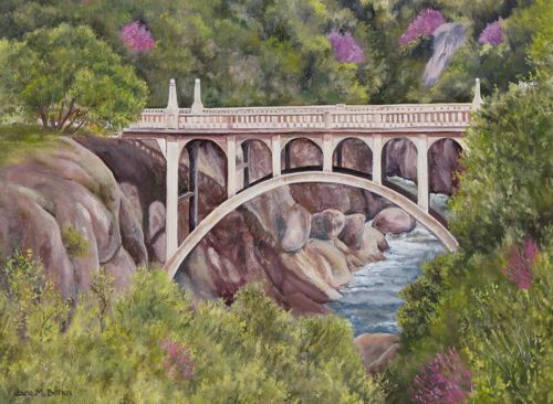
Learning, learning, always learning. When I stop learning, I will be dead! Here is my current personal painting lesson (and I may be the “meanest” teacher I have ever had!) If you are a regular reader of this blog, you will know that I love this bridge to the point of ridiculousness. Apparently I am not alone, because each time I draw or paint it, it sells. The most recent version hasn’t sold; because I know the subject is a winner, I had to take a hard look with my most critical attitude at the painting. Without going into specifics, look at the Before version:

Now look at the After version:

Now that I have seen it on my screen, I can see that my lessons from this painting aren’t over yet.

Okay, now maybe it is finished. Maybe. Perhaps. I’ll let it mull awhile longer.

The Elephant, again

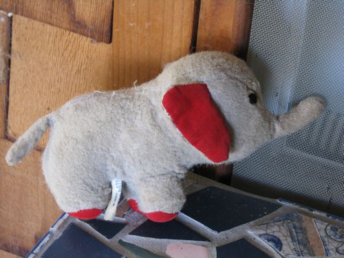
A friend told me she was having a bit of trouble seeing the elephant on Alta Peak. With a little help from my very old buddy, I’d like to give her a hint:

Despite the fact that my little buddy’s trunk goes up, there is a remarkable resemblance! (MM, did this help you?)

What to Draw

This is the third article in the series, Thoughtful Thursdays.

Were you ever given vague art assignments in school? The ones I remember the most vividly were generally focused on ways to use different media, and somehow the students were expected to be instinctively creative enough to come up with an idea to illustrate the teacher’s inadequate instructions. “Show transparency” “Design a container for air” “Make a self-portrait but don’t draw your face” (as if we could draw our own faces at that point!)  In addition to terrifying us, those assignments instantly caused the problem of WHAT to draw or paint or sculpt. Endless thumbing through magazines provided by the teacher only occasionally solved the problem of WHAT (never mind the copyright issues!)

Now, I hear similar woes from my drawing students. “Oh no, I’m almost finished and I don’t know what to draw next!”   I watch them struggle through piles of photos to find an image to draw and remember that awful feeling of a blank mind.

Part of the struggle comes from something I tell everyone who draws with me: pick something you LOVE because you will be staring at it for a long time.  This is much harder if the only photos available are from someone else. How is it possible to love something that represent another’s experiences?

The older we get, the more we experience, and it is precisely this experience that gives us the ideas.   Now that I am at the 1/2 century mark, the ideas are overwhelming me! Everything I see, every place I go, ideas are flooding into my brain. Nothing in my life is exempt from consideration for a drawing or painting. The only necessary filter is the consideration whether or not anyone else will like it, because if my art doesn’t sell, I will have to get a job!

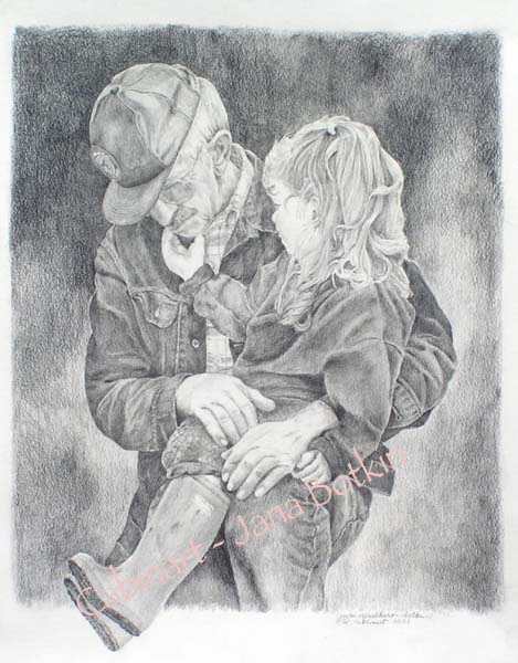
If making art is part of your life and you find it difficult to choose subjects, remember to examine all your life experiences, surroundings, views and belongings. When you encounter the parts you love, you will have the beginnings of a piece that you will enjoy spending time on, which ultimately translates to a good piece of art.This is my dad with his great-niece Claire, who had just lost her grandpa. I drew this in the year after my Dad died, and was somewhat fearful that I’d cry the entire time. Instead, it felt as if I was spending time with my Dad every time I worked on the piece.

How Many At Once??

This many! If you compare the photos to those in the January 13 posting, progress is evident. It is a bit random, as I choose what to work on based upon 2 things: degree of wetness and colors already mixed on the palette.

Hospital Rock: A lesson in choosing photographs for art

In what passes for winter in Tulare County, sometimes it gets cold and gray. Count on it in the flatlands. Moan and complain about it in Three Rivers. If you’re smart, you’ll just drive up a ways and voila! Sunshine! That is what Michael and I did on Saturday. Ever been to Hospital Rock? I had, but only to the upper parts and not to the river. The interesting thing is this: I recognized the rocks because I have drawn them! As always, I was looking for light but seriously distracted by the lovely old rockwork. Under the photos, I will put my opinion of how each photo would be useful to an artist.

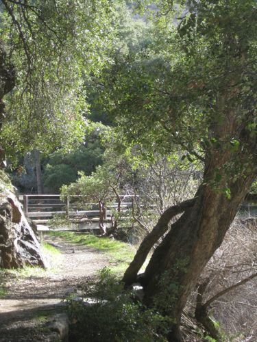
There was a bridge across the river (middle fork of the Kaweah) until it washed out in the ’55 flood and a wall was added for a viewing platform. This has the clear detail necessary for a pencil drawing, but probably not the best choice of subjects because it is sort of an odd structure. Those sorts of things make sense in photos but cause an art viewer to wonder what the heck it is!

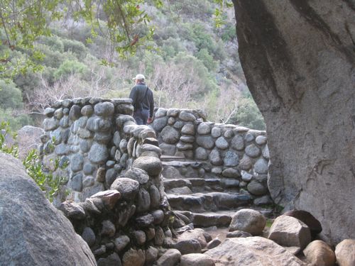
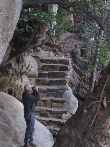
There are inexplicable stairs all around. Clearly this was constructed in an earlier era before evidence of humanity was forbidden (except signs with cautions and warnings.) This has good clear detail for a pencil drawing, but not a great one because there is no visible sunlight. The person could be included or left out, depending on how much fiddly detail one wanted to do. If the face was showing, I’d say FORGET IT – NO FACES SMALLER THAN AN EGG! (ok, I might not shout, but I’d be very adamant on this point.)

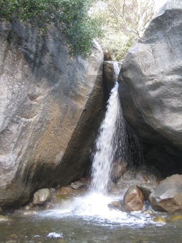
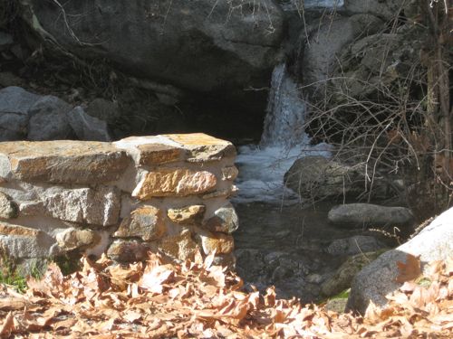
I recognized this little waterfall – it had my friend’s parents standing to the left in the picture that I drew. This would make a nice pencil drawing –  great contrast but not enough color for a painting.

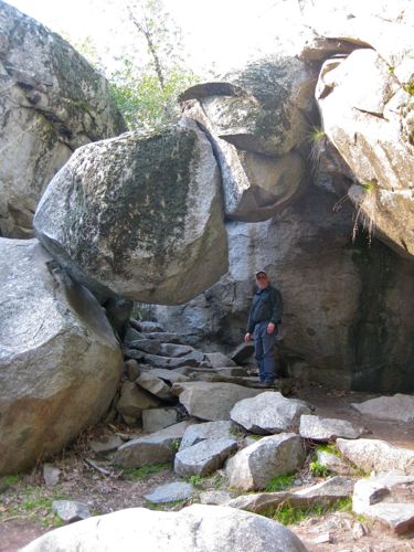
Would the Park allow a trail to be built beneath a rock like this now?? Would they even allow the rock to remain? There are no warning signs – amazing! This photo is good for documentation only – the subject is too weird for art.

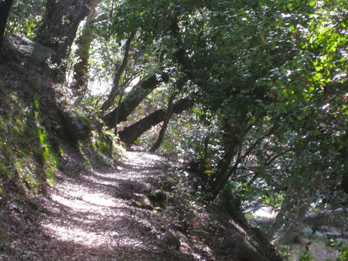
This is the kind of light I look for. It would make an excellent painting. Also good for drawing but it would be hard to render the textures unless artist is very experienced.

The Paradise Bridge was replaced in the early ’90s (Michael worked on that project) and it washed out in the ’97 flood, which was only about 1/4 of the water experienced in the flood of ’55! I wasn’t born yet. (Just had to throw that in in case you were wondering.) This would make a drawing and maybe a painting but I’d have to think about what to do with that heavy-looking tree leaning out to the right.

Hard to imagine it washing out. This photo is good for documentation only.Too much texture and the main subject is too small for a good drawing. In case you are wondering, I learned this the hard way. 

Rockwork, light, this would make a nice pencil drawing. Maybe even colored pencil. Maybe a combo! I’d mess with the composition a tad to get the edge of the wall off dead-center.

What do you think?