Flags should be in color!

flag-house.jpg

  This little gem was fun! Seems to me that any time there is a flag, color should be applied. On the last commission, the customer and I discussed adding color to the flowers. We concluded that there was only one place it would work, and then the front door would no longer be the main event. With this drawing, the color is conveniently located next to the front door, so that is not an issue. (Ick, that word really bugs me. However, note its proper usage here.) 

And here is an admission: I am getting old. I know this, because 8×10 feels very very small. Much of this drawing happened under a giant lit magnifier. Those diamond shaped windows next to the front door took an alarmingly long time to get right – no pencil point can be sharpened small enough. This used to be normal work for me, and now it is so very very tiny that I can’t believe I used to draw this way! And to any of my drawing students who are reading this, please please forgive me for expecting the same from you if you are over 45 years old!! 

Another Little Clue

piece-two.jpg


Have I shown you this one yet? Couldn’t find it in the archives, so if I am repeating myself, please excuse me. If not, here you go. And by way of a disclaimer so you aren’t disappointed when it is revealed, this is probably a bigger deal to me than to you. I get a little excited about stuff sometimes. . . probably need to get out more. 

Happy House!

ps-house.jpg Another week of drawing has produced this house for a happy customer. I love happy customers. Happy customers make me happy. 8-)p.s. I found a box of Stabilo pencils on eBay (thank you, Sophie!) and won the auction!  

a little help

During the years of art as a full-time business, I have needed help from time to time. When the studio was a public space, it took a tremendous amount of time for all the work of retail in addition to producing all the art.  Back then, notecards were a huge seller for me, and at one time I had about 30 different packages for sale. Once my husband said “ENOUGH” to being used as free labor, my parents would take cartons of cards home for packaging. Around 1998 or 1999, card sales began slipping as the internet started growing. This cut into sales, but it also lightened the physical, hands-on assembly-line type work. This year there are several events where cards are expected to sell well. Cards have continued to be a steady part of my business,  just in a smaller quantity than in the 80s and 90s. Suddenly I am realizing that there are many many unpackaged cards that need to be ready for the first event on November 22. This happens at the same time my commission customers are expecting their drawings! (I’m not even going to think about the paintings I’d like to have finished for these events. . . oh-oh, is that a twitch beginning under my left eye?) As I pondered the mystery of how to be 3 people at one time, my friend Nina said she’d love to help me! Oh my, what a blessing! Today we had the nicest time together in the studio: I drew and she packaged. You may have seen this before, but here are a couple of the cards she worked on:

general-grant.jpg4-guardsmen.jpg

The General Grant Tree is the Nation’s Christmas tree and is in Kings Canyon National Park. This image sells consistently, and I have reprinted it many times, in different sizes and even once using dark green ink. The Four Guardsmen don’t actually have a sign as you pass through them on the way up to Sequoia National Park. They are consistently beautiful and awe-inspiring, regardless of the time of day or the time of year. In reality, there is a small redwood tree somewhere near the middle of this scene, and I have chosen to omit it in the drawing. There is also a road sign with an arrow that didn’t seem to enhance the picture. . . and it is the artist’s prerogative to clean up the messiness of life!   

Did I really say that??

Tuesdays are for drawing lessons. I teach a total of 5 classes. Before you say, “FIVE??” in great shock and awe, let me reassure you that this is nothing like what a school teacher does. The most I have in any class is 8 people (who all WANT to be there!), and all 8 never show up on the same day. One class has only 3, and another has only 1 (I missed you today, Adalaide!). If the one doesn’t appear, I go grocery shopping.   Today in drawing lessons Bob brought the tiger on which he has been working very diligently for quite awhile. It is a challenging piece, as he is using a newspaper photo as his guide, and it is a little blurry. He is doing this drawing in colored pencil and often works at home. Bob tells me that he can’t draw very well, but despite this declaration, he has made a large number of beautiful pictures since beginning lessons in 2001.    So I was looking at his tiger very carefully, thinking about ways to encourage him and help him  progress. One part of the mane looked particularly well-done, and I told him so. He laughed out loud and said, “You did that part!”  Sheesh. How embarrassing.   

piece-two.jpg  Here’s a look at another piece of what is coming on November 22. (trying to take my mind off what a doofus-y teacher I am!)

something coming. . .

first-piece.jpg

Here is a little hint. More will be revealed in the fullness of time!

The whole picture will be revealed on November 22. 

Creation and Evolution

I believe in creation or “intelligent design” rather than evolution. God is perfect, so he got it right the first try! However, I am far far (oh so very very far) from perfect. Evolution is the way my portraits get finished. Have a look at the evolution of this week’s work:(These are photos of the drawing as it progressed)  c1.jpgc2.jpgc3.jpgc4.jpgc5.jpg The changes are very subtle, and it has been amazingly difficult to capture a likeness in this man that I really do not know. All I can do is match the chosen photo to the best of my ability. Each time I think he matches his photo, I email the office manager who is my main contact. She and the others in the office evaluate the likeness, then she calls me and explains the ways I have not yet captured his personality. Meanwhile, I add clothing and background.   I haven’t heard yet if the latest version does the trick.  When the drawing is photographed, some of the details and subtleties get lost. He is really a pleasant looking man, despite the fact that the photo of the drawing looks a bit worried.  So we wait. . . (his portrait and I – there is no mouse in my pocket!)

Dr. Done!

(I know, it should say “finished” instead of done, because he is not a roast in the oven! But I like the alliteration of Dr. Done, and this is my blog, so there.)

dr.jpg

 Now that the drawing is here on the screen, I can see that that background needs a bit of smoothing.   It doesn’t look that rough in the original drawing, but it couldn’t hurt to perfect it a bit more. How does one know if a drawing is finished? When one cannot think of another thing to do to make it better AND when the customer is happy! 


All About Drawing Pencils

pencils.jpg

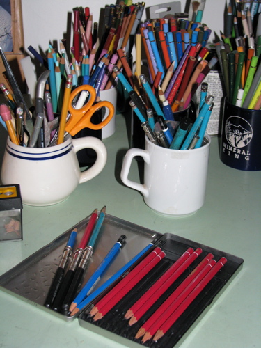
  I use three different brands of pencils. None is particularly better than any other, but my current favorite is the red one, Stabilo. I can’t find them anymore, but being someone who dislikes shopping, I haven’t tried very hard yet. The blue ones, Staedtler,  are pretty good, quite dark, but not as dark as the Stabilo. Turquoise, made by Sanford, are the ones I used in college, so there is a weird sense of loyalty even though they aren’t as dark as the others. Besides, they are very easy to find.  There are other brands, but these are enough for me. You can see colored pencils in the cups in the background, but that is for another entry. 

That little black and silver dealie on the end of the three pencils in the lid of the box is a pencil extender. It used to be a bit of a game to me to see how short I could get a pencil and still use it. Then carpal tunnel syndrome kicked in, and it became clear that the longer the pencil, the less the pain. 

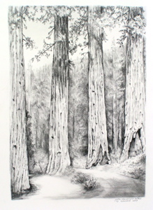
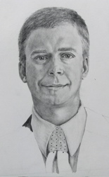
For years I drew without understanding what the H and B actually stood for on those drawing pencils. With some reading, I finally learned that H is for Hard and B is for Black. The higher the number with the letter, the more there is of that particular quality. So a 5H is harder (and lighter) than an H (which is 1H but the 1 is assumed). A 6B is blacker (and softer) than a 3B. An HB is exactly in the middle, and is the equivalent of a #2.

And get this: the lead is a combination of graphite and clay. The more clay, the harder and lighter the pencil. The more graphite, the softer and blacker the pencil. Ever used a pencil that scratched? It probably had a rough piece of clay in it. (Don’t you just hate that?)

  Sometimes students ask why the pencils don’t come with erasers. EASY answer! Because we would use the eraser up long before the pencil, and then we would automatically flip the pencil over to erase and scratch our drawings. By forcing us to develop the habit of picking up the separate eraser, the pencil manufacturers are sparing us some unnecessary pain. (And for that,we thank you, lovely Pencil Manufacturers.)

  All this leaves me with some questions: 1. Who decided that hard is the opposite of black? and 2. What in the world does F stand for? 3. How does this all fit with the school-type rating of pencils, 1, 2 and 3?  

Eyes again

more-eyes.jpg “The eyes look good but there is something a little bit wrong with the mouth”. Yeah, I expected that. No problem! Have pencil, have eraser, can fix!